
Using the power of color can change how
people use your software and increase productivity and view your business. 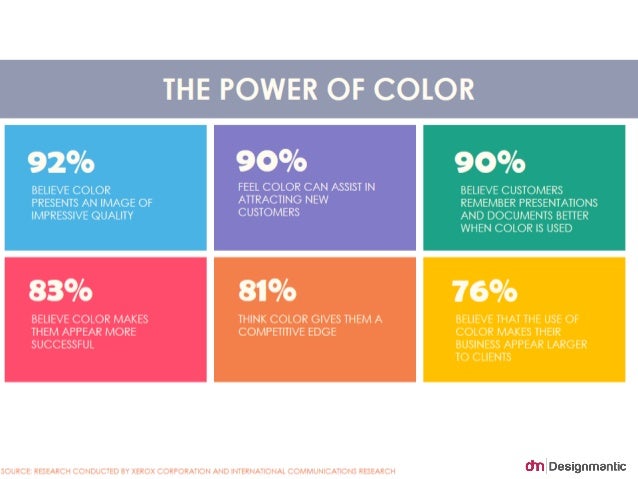
 Like death and taxes, there is no escaping COLOR It is ubiquitous, but it's rarely recognized for it's power to control peoples behavior. By utilizing the "Power of Color" within the MDS system you can easily draw attention or give simple visual queues on any screen or field with the click of a button.
As an example the Open Accounts Receivable Screen now shows and past due invoices in RED - alerting a customer service rep visually that the invoice needs to get paid.
Simple and easy system changes like this allow you to control how people use the system and build a more user friendly environment.
For more on the power of color see below.
The Power of Color
 |
Red is an engaging and emotive color. drawing a user's attention to elements on a screen.
|
 |
Yellow is the first color a person distinguishes in the brain. Excellent for use in classrooms.
|
 |
Orange has the characteristics halfway between red and yellow. It is one the best colors for stimulating learning.
|
 |
Blue is the most tranquilizing color.
|
 |
Green is also a calming color. Generally Associated with positive or good outcomes.
|
 |
Brown promotes a sense of security, relaxation, and reduces fatigue.
|
 |
Gray is the most neutral color.
|
Dark Colors lower stress and increase feelings of peacefulness.
| |
Bright Colors such as red, orange, and yellow spark energy and creativity.
How does your software make you feel? | |
For more information on TSH or MDS call The Systems House, Inc. at 1-800- MDS-5556. Or send a message to sales@tshinc.com
Click here and tell us how we can help you with your business solutions.